Showing posts with label Our Living Room. Show all posts

Our Spring Living Room + An Easier Way to Hang Frames Straight & Level

I don't normally decorate with the seasons (besides Christmas) mainly because I don't want to store seasonal decor nor am I quick enough but I managed to do so in our living room this spring thanks to some springy fabric finds I made pillow covers out of.   Just changing those up made all the difference and was all I needed to do to go spring in here since our furniture can already pass for the season.  I ventured out of our norm and threw in a little bit of blush pink (I made those pillow covers out of this curtain panel* - it's semi-sheer so I layered it over the existing pillow cover) that nods to the abstract painting that's hanging in the breakfast nook.  You can't see it in the photo below but here it is up close and personal.  Just adding that pink really unifies this whole, big space. 


The kitchen in the background will hopefully soon look more like it belongs (paint!) and maybe even the fireplace (mortar!) but even still, I'm liking the fresh new view.

It looks especially fresh when you look back on what it was two years ago:

Living Room Update + Some Fireplace Ideas

Whew!  After a whirlwind romance with primer and paint, we are FINALLY done painting the living room.  Ok, so there a few spots that need to be touched up like where I accidentally got some trim paint on the ceiling but they're not noticeable to anyone but me so I'm going to push them off like a lazy person.  I need a break from touching paint brushes and rollers to any part of this room.  ;)  It was a doozy of a project that required lots of painting after lots of bedtimes because of oil-based paint fumes but hip hip hooray.  We're over that mountain.

I took this a few weeks before we started priming:

So. Much. Wood.  Not even our modern-era furniture can make a dent in those aesthetics.  Instead of the furniture pulling the room more towards 2020, the room pulled the furniture back towards the disco age.  💃

Sometimes I feel bad for even wanting to paint over stained wood in great condition but, in this case, we're both so glad we did.  It's like a completely different room!

Living Room & Kitchen Update

Last week, instead of typing on the old keypad here, we were spending our free moments knocking out some major (well, sorta major) progress in the living room, kitchen, and breakfast nook area - it's all one big room now thanks to a wall getting taken out.  

We still have yet to actually paint but we did spend a few nights after the kids went to bed priming.  The ceilings had to be primed along with the trim and the walls...it was quite a feat.  Not only did they need to be primed, but we had to use oil-based primer (the worst!) to knock out that smoker smell once and for all and because the wood paneling required it.  I'll write a whole post on why and how to paint wood paneling when we are all done and that will have all the details and explanations.  Until then, hows about a little update?

Warning, I did not clean up my house for you.  I just snapped these in-progress shots real quick like when the sun was shining.  I know you don't mind.  ;)

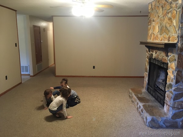
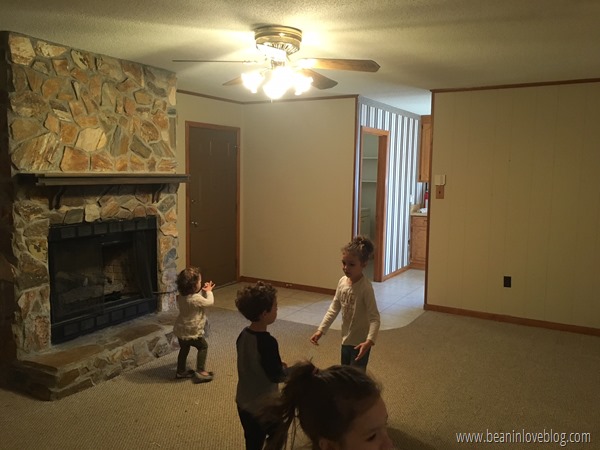
Starting at the beginning (for the biggest shock factor, of course), here's what the room looked like right after we closed: 
I know that, if you've been reading for awhile, you've probably seen this before a million times so I apologize, but nevertheless, a quick recap is always fun, no?

Now, things are a heck of a lot whiter and a heck of a lot brighter:

Living Room Tour

Recently, I’ve been thinking a lot about why I really enjoy decorating our home.  I’ve always found a good bit of fun in decorating – my mom decorated my room when I was younger based off of one of my favorite characters, Minnie Mouse, but I didn’t really play a starring role in the whole process.  She bought everything and was really good at styling and so she did it all and I lived with it for several years.  I tweaked things here and there though, nothing major, but what I really loved is that feeling when it was spotless.  Don’t get me wrong, I was very good at leaving my clothes scattered on the floor for days/weeks and clutter on my dressers and desk but I thoroughly enjoyed decluttering and placing the 3957 pillows I had on my bed perfectly once in that blue moon.

Fast forward to college when I really got to take decorating my own dorm room by the reins and went all out.  I spent $70 of my own, hard-earned money on a comforter I had to have at Linen’s and Things (now defunct) and made sure any other accessories I bought for the room coordinated. 

That passion for decorating still stands but I’m finding that I’m enjoying the process a little less than I did before.  I don’t think it’s that it’s just not as fun anymore though.  I think it’s kids.  Haha!  I decorated my entire dorm room in two whole days, ceiling to floor, and now it takes me weeks to get one room done.  Kids.  The satisfaction of decorating for me is more in the end result than the process anyway so when that end result is akin to the tiniest light in the longest tunnel, it feels overwhelming at times.  BUT, I wouldn’t have it any other way.  I know that’s cliche but it’s truth.  These four chicklets have given me more satisfaction than the final reveal of a million decorated rooms.  :)

On the same note, my reasons for making our spaces pretty have changed a lot.  Whereas before I just wanted a pretty dorm room/first-home-before-kids to come home to, now changing up spaces breaks up the monotony that my life can sometimes be.  I’m a big routine kinda gal.  Growing up I would have said I leaned more towards the unplanned/spontaneous side of life but I think having twins pulled me full circle to the other side.  No routines/structure when you have newborn/toddler twins = lots of stress.  I can’t say that’s a fact but I can tell you that the days where we at least tried (even if we failed a little) to stick to our routine were a heck of a lot easier than days where we completely disregarded it.  And so, structured and rigid I’ve become and that I’m guessing I’ll stay until we’ve got four independent children running around vs. the current dependent ones.  The routine-based life is wonderful and I thrive in it but it can get boring day after day after day after day.  So, adding some new pillow covers here or slapping up a new paint color there, spending naptime making something to hang there or building this to fill this space brings a much-needed surprise visit to that routine and a happier mom makes me.

With all of that, we’re switching gears!  Strap yourselves in for a living room tour! 

I took this before we moved in and started tweaking things:

IMG_6830Covering up the one and only window in the room were some heavy, light-blocking curtains and it looked like there was an eruption of tan everywhere.

I couldn’t get those curtains down fast enough!  Let there be allll the light there can be, I say!  Here’s where painting the walls white and adding in our furniture has us so far:

All You Need is…

L O V E…and a little bit of white paint.  Maybe and maybe not but with all of the orangey-wood trim in this casa, I don’t know what else to go for and I’m playing it safe! 

I do know, however, that it has been so great shaking up the living room to take it from the heavily curtained, brown, brown, brown before:IMG_6831


to an in-progress and better after:IMG_8282


Ikea Mackapar Hack

I’m baaaaack!!  But still not unpacked.  Ack.  It’s ok though because we’ve done a hack and hung a rack.  So hopefully you’ll give me a little slack. 

Ok, ok, I’ll stop before you feel like you wanna whack me.  ;)  The girls and I have been doing rhyming in homeschool…

Ahem…

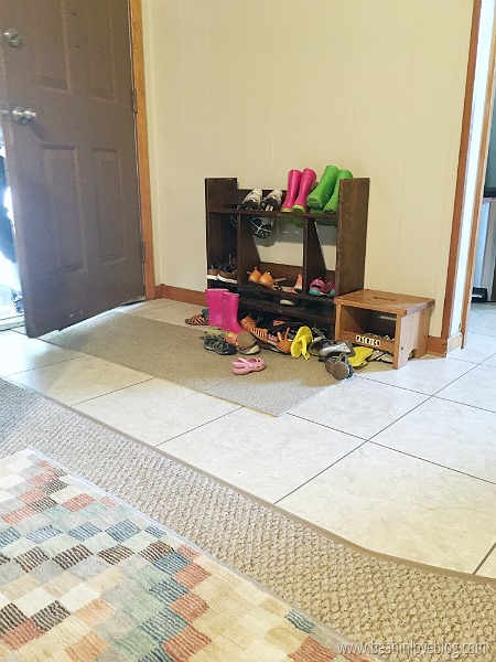
We have a situation.  Our back door is our most used door and therefore, where we keep all of our most-used shoes…haphazardly (usually) set on this little shelf (previously a bookshelf in Sebastian’s old room).IMG_7269

It looked a mess because it was kind of a mess.  Our closets are small and lack space for lots of shoes plus I like the idea of shoes being near a door for easy access so this was our situation.  I feel like entry ways should always be clean and uncluttered since they’re the first things you walk into when you come home.  They could make or break a mood, ya know?  When ours is cluttered and messy, it really makes me happy to be home.  So inviting.  Like, welcome home to your peaceful abode…ooh!  Watch out for that little shoe!  *trip and an ankle twist*  Ok, so maybe I’m being a little too dramatic but really, first impressions do count, right?  That can somehow apply here.

Anyway, the wall next to the door was begging to be a functional one so we had to come up with something.Image-1 (4)

DIY Grommeted Curtains

Hallelujah!  I got to do something “fun” whilst getting ready for this sell-our-house thing!  I’m tired of painting the kitchen ceiling, touching up loads and loads of trim paint, cautioning the kids against touching anything (“Do NOT drag your toys along the walls pleeeeease!!!”), washing siding and trim, etc…

I got to make curtains!IMG_8717


If you’ve been a long-time reader, you might remember that once upon a time, I scored a long curtain rod at Dirt Cheap and flanked our living room’s french doors with some long curtains to make the room feel more “homey”, as I put it.  I started out with some sheers and then later made some tan and white, geometric-printed curtains that I loved for a long time.  Well, I wanted a change in pattern so I sold those and found some plain white, thick fabric remnants that I thought would be a perfect medium to do knock-off these curtains from West Elm with…but then I decided that I wanted the curtains to be more subtle and blend into the walls a little more so I just kept them white.  There’s still a chance they’ll look like those West Elm curtains someday but right now, I am loving them as-is.  Phew.  That all sounded like a mind-making disaster, didn’t it?  If you’re looking for someone to pick a design and stick with it, don’t look here.  The winds of change blow quite frequently in this casa. 

The parts I love the most though, are the grommets at the top.  I’ve always used rings to hang curtains because it was the easiest to just sew a big rectangle and hang it up.  But then a good friend of mine put grommets at the top of her living room curtains and told me how easy it was and I just had to.  I mean, look at how they fall!  I toyed with them a little before I took pictures but really, for the most part, the grommets create those big folds that go from top to bottom and they hold them there.

I bought these grommets at Walmart.  They’re the exact same grommets sold at the fabric stores I looked at, only without the coupon mark-up (I’m convinced stores that always have running coupons mark their items up…these are $12.99 at JoAnn Fabrics.)  You can also find them for a little bit more on Amazon.   

So, let me tell you my grommet story.  It’s so easy.  You’ve gotta make some grommeted curtains.

Floor Score

Hey!  I’m just popping in to let you know we did NOT fall off the face of the Earth but our living room floor did…well, kinda.  You see, we had some water issues (you might remember me blabbing about the chimney leak and a water influx on the patio-now-screened-in-patio) that are now solved but that left some of the planks of our laminate wood floors in the living room warped.  Well, since we’re about to sell our house we reckoned yesterday was good time to replace those.  Unfortunately, the previous owner didn’t leave us any extra planks BUT something crazy happened, while waltzing through our local ReStore last year, we spotted a box of the exact same flooring and swiped it up quicker than quick.  Fast forward to yesterday morning, when we pulled that box out of the closet to finally repair the flooring and guess what?  The new planks are ever-so-slightly different than the existing.  They’re from the same company and look exactly the same to the naked eye but the tongue and groove were about a millimeter different.  WOMP, WOMP.  So, this was the scene in our living room yesterday evening:

FullSizeRender (11)(old floor on the left; new on the right)


Hide Ja Wife…

hide ja kids, and hide ja modem. 

Back when we installed the shelving along one side of our fireplace, I had grand plans of keeping it functional on top of the form.  We needed another place to keep some of our books and so it does, but we also needed a place to keep our internet modem and wireless router.  The bottom shelf was were I wanted those to go.  But, as you can tell, modems and routers don’t really contribute much to aesthetics.
IMG_3459

But thank goodness for Pinterest because a long time ago I pinned this idea from Sewing Barefoot and then much later, thrifted the books you see on the far right for the very purpose of that camoflage project.

IMG_6450
When I took the pictures for the shelving project post, the modem and router were nestled ever so hastily behind a white basket to hide them from view.
IMG_6444PAB

But now, I’ll let you take a gander and guess as to where they might be.
modem (5)

Ok, so I might’ve made that easy for you since I gave away the books but hey!  Out of sight and so much better, right?!  :)

modem (10)

I started this project last weekend while I was visiting my sister and finished once I got home.  It really stinks that it took me so long to finally get it done.  I thought it would require more time and effort than it really did.  Twenty minutes all-in-all was all it cost me and every second of that was worth the better view.

So, want to make your very own modem hide-out?  It’s perfect for hiding just about anything you can fit behind a few books, even secret levers that open up a secret room…if you’re into that kind of thing.  ;)

Here’s how:

First, grab your supplies.  You’ll need a box of some sort to hold whatever it is you’re wanting to hide, several books that, when placed together, span the entire width of that box (you’ll be cutting them apart so don’t use anything you’re planning on reading anytime soon), a razor blade or scissors, a hot glue gun, and glue sticks.
IMG_3444I found all of these books at a local thrift store last year for 75 cents each and used a regular ‘ole cardboard box that I cut two sides off of to hold the modem and router.

Next, grab your razor blade and any pent up anger because it’s time to rip apart some books.

What you’ll want to do is open the front cover of each book and cut out the middle.  Be careful to only cut out the inside of the book and not to press so hard that you cut through the binding. 
IMG_3446
IMG_3449Repeat the same step with the back cover of the book.

Funny story:  I noticed upon going in to cut apart one of my books that, not only was it gifted to someone but it was also signed by the author on the very first page.  #whoops
IMG_3450Must not’ve been that important if it was donated to a thrift store but still, I felt a little rebellious taking it apart.

After all the insides of the books are gone, decide how you want the books to be lined up.
IMG_3451
Once you’ve got your layout (make sure all your books are right-side-up too!), it’s time to shorten all of the covers except for the two on each end.

IMG_3452
To do this, I laid each book out flat and held a ruler up against the binding while I cut.
IMG_3453This gave me a straight line to run the razor along and helped ensure that each book would be shortened the same amount.  (PS, use a cutting board lest you want to cut into whatever solid surface you’re working on.  I used a book I had decided not to use…you can’t see it, but it’s there.)
IMG_3454
Now it’s time to glue all of your (what were) books together in the order you had planned.  I just ran a small line of hot glue down the cover stubs and attached each book to its neighbor.
IMG_3457
After all the books were glued together, I glued the front cover of the farthest book on the left to the left side of the box.  Then I glued all of the books to the box by running a line of glue horizontally along the middle of the side of the box that’d be up against the cover stubs and then placing each stub into the line of glue.  The important part here is to make sure that the stubs are straight when they hit the glue; make sure they are at a 90 degree angle with the box.

When I had the basic structure of my hideaway finished, I had a small gap between the back cover of the farthest book on the right and the box.  Not a huge deal and one that could’ve been left as-is, but just because, I made a little spacer by gluing together a few layers of cardboard and then glued that into my gap.
IMG_3458Nice and sturdy does it.

Up at at ‘em it went with our modem and router tucked nicely behind.
modem (11) 
I know I said originally that my plan was to house the hidden modem and router on the bottom shelf, but when I tried that, the cords coming out the back of each made the whole book hideaway stick too far off the end of the shelf.  Boo.  So, for now and maybe forever, it sits on top of our blu-ray player.  I’m still not sure if I’d rather just brainstorm another way to get it back on the shelf or not but for now, it’s hidden and that’s all that matters.  I did flank it with two other books on each end to further hide the wires that extended out the back though.  Had I a bigger space, I probably would’ve made this thing with some larger books.  Keep that in mind when you’re making your own.  The covers on the two books on each end should extend or be longer than whatever you’re trying to hide, wires included.

modem (12)
And speaking of hiding things, we finally got around to figuring out how to fanagle all the wires coming from the electronics over the fireplace into our mantel’s side panel.  Remember when Chelsea and I built our new mantel and how she helped me make happen the hidden panel I wanted for that sole purpose?

Well, here it is exposed with the lone two wires that need to run down it to reach the outlet below:
IMG_3460One of them is the main cable wire and the other goes to a power strip that sits right on top of the big bracket that holds the TV on the wall, to which everything is plugged in.  Every mantel ever should have a hidden panel, that’s what I say.

I’ve also been busy restyling/adding to those shelves and hanging up those three big frames to fill up the big expanse of wall.
modem (1)The picture doesn’t make it look as good as it does in person.  I’m still working on how to get this whole space into one photographic rectangle. 

Those frames are oldies and still filled with the same floral calendar prints I framed ages ago.  I’m hoping to get a family picture up into them that’s one big picture spread through and filling the three frames.  It’s gonna be sa-weet…whenever it happens.  The only new things on the shelves are the plants – the top right a thrift score (fake) and everything else clipped from out my front or back door.  The ampersand was a $2 thrift find that I had planned to spray paint gold.  It once looked like this:
IMG_3485This is right before I primed the entire thing white.  When I went out to give it the gold coat, I stopped after spraying from just one angle and loved how it looked so I just quit.  I kinda love it.

And that’s that…all starting with our new and improved living room shelves complete with a modem you’d never know was there if you didn’t know because I just told ya.  If you make your very own modem-hider, I’d love to see it and add it to this post!  Email a picture to me – beaninlove@gmail.com or tag me on Instagram (@beaninlove). 

Peace and love and all that jazz.

School

.           .           .


how to hide your modem

Our Paint Chip Family

Ooh, DIY art.  It's my favorite.  And since I'm really, really, really bad/slow at getting real pictures put into real frames, it's really easy too.


So, when I saw the above gallery wall done by Jessica at Pretty Providence, specifically that framed triangle artwork in the upper left, I was inspired.  I got to work one nap time and created my own version of it in the form of a little abstract family portrait, a very abstract family portrait.See?
It's Anthony and I on the left (he's Neutral Gray even though he's anything but neutral and I'm red/orange or "Red Hot" as Behr calls it...ha!), and the kids are two blues and a golden yellow (or boring "Sunwashed Blue", "Honey Beige", and "Harbor").  It's going to have to get tweaked a little bit here in the next few months but since I did this project months ago and am just now getting around to sharing it, we'll stick with five triangles instead of the six we really need now.  The question that now remains is, what color should the new little lady be?  I'm accepting ideas...
The five of us are hanging in the toy corner in the living room; a little area we moved all the toys to last year when we rearranged this room for better functionality.

Want a little triangular fam of your very own?

You know you do!!  Here's how you can birth one...

Grab some paint chips.  I used chips I had on hand from prior projects.  
(Soapbox note:  I don't condone just going into a home improvement store and grabbing paint chips for free for projecting.  I feel like, and maybe this is a little dramatic, but that's almost stealing.  Somebody pays for those and even though they're up for grabs and free for us consumers, I don't think that means going and grabbing a bunch for non-paint related purposes is cool.  However, I do think that going into a home improvement store to buy something and supporting them financially in another way gives you a little more justification to maybe grab a few for a project.  Just my two cents.)

A few of them were squares so I just penciled a line halfway down the middle on the back to create two little triangles.  Then, I used one of those triangles as a template to cut triangles out of the chips that weren't squares.

Then I just cut out the triangles...with my food scissors, yes.  Sometimes they're just the closest and sometimes I'm just lazy.


And then I apparently didn't take or lost any and all pictures of how I got them in a frame but luckily, that's Kindergarten-level stuff.  I just grabbed an old frame I had laying around that I had broken the glass to years ago, stuck a piece of white, matte photo paper inside, and glued my triangles in the order I wanted them to the photo paper.  I used photo paper because it's a little thicker than regular computer paper but really, you can use any kind or color of paper you want.  It's your family.  Make it how you want it.  :) 


Along with our family triangle portrait, I hung this print from Hatch Prints (also used in our recent pregnancy announcement) in a thrifted oval frame that I spray painted white and the mat black (they were a nice shade of gaudy pink), and framed picture of the kids I rehabbed from this thrifted frame:
I bought it for the color of the frame but painted the mat white and then went back in and painted in the gray border for flavor.

This little corner of the living room is set now but we've made some major progress in other corners that I can't wait to share with you.  Stay tuned for one rather large update next week!  I'll give you a hint, it rhymes with boo fantel...

Feeling Shelfish

Let there be more storage! 

We finally got some long-awaited shelves up in the living room a couple of weeks ago!
 IMG_6444 

We really needed more space to put books as the bookshelf currently in our bedroom is overloaded and these shelves were a great and inexpensive solution.
   IMG_6449

Here are all the details on how they went up…

Spacing
To start, we had to figure out how many shelves we wanted.  Initially, I was set on four.  So, I stuck four pieces of painter’s tape up on the wall about where I’d want the shelves to be and stared at them upon passing for a few days.
IMG_1354
After those few days, they started to look a little too close together but I didn’t really want to raise or lower them so I took them down and re-taped with three lines instead.
IMG_1353
After much hemming and hawing and consulting friends, we decided that three it would be.

The Brackets
I’m kinda in love with these curvy metal things.  I got five packs of them (Threshold from Target) at Dirt Cheap last year for under $2.50 a pack (80% off original price).
IMG_1350
Four of them were black and the other one was silver so I knew I’d definitely be painting them to match.  After a coat of Clean Metal spray primer* and a few thin coats of my favorite gold spray paint*, they were ready to go up…right after I also spray painted the screws that would hold them up since they would be visible.  Sticking the ends into a diaper box and then spraying them from the top ensured I didn’t gunk up the threaded parts with paint.
IMG_1351
The Wood Planks
We bought two large pieces of wood at Home Depot and had them cut-to-size in store to make the shelves.  (I think the wood was called common board.  I don’t remember the actual type of wood.  Sorry!  Next time I’m there I’ll look and update the post.)  The two bottom shelves were cut from one piece of wood and the top shelf plus a matching extra shelf we have were also cut from one larger piece.  Home Depot makes the first two cuts of any piece of wood you buy for free so we paid zip for the cuts and (bonus!) didn’t have to do it ourselves!  We wanted to keep them au naturale but I did brush two coats of Polycrylic over the top of each piece to protect them and so I could clean them without ruining them.
IMG_1349
After we got them up, we had major doubts about leaving them void of stain.  They just looked really unfinished and hastily hung.  I reached out to my Insta and Facebook friends the second we got them up, eager for favorite stain colors, and I got lots of ideas in return (thank you!!).  Before we stained them though, we decided to just live with them unstained for a few days to make sure we didn’t like them and whaddya know?  They grew on us and we decided not to stain after all!
    
Spacing
We hung the shelves so that they butted right up to the brick of the chimney.  The plan is to eventually move the cable box, modem, and blu-ray player onto the shelves so we wanted them as close to the television as possible.  And we wanted to give them a built-in feel…does that sound like crazy talk?  Probably.  My heart longs for built-ins and this is as close as I’ll probably get in this house.

IMG_6445
Their placement will make a little more sense a few paragraphs down.  For those of you who want technical details though, the shelves themselves are 8 inches deep.  Each bracket is screwed into a wall stud and so, since the closest wall stud to the chimney was 14 inches out, there is 14 inches of wood shelf extending out from the end brackets with 16” in between each bracket since that’s the distance between the wall studs.  Also, there is about 15 inches from the top of one shelf to the bottom of the other vertically.  Make sense?

Currently, they’re filled with a bunch of stuff that will probably get moved around.  I just wanted to get them up and running for this post.  There are a lot of browns and golds going on, which isn’t bad, but I’m wanting to incorporate more beachy hues kind of like in the hutch opposite the room.  Of course all the books on this shelf will be actual books that we read vs. thrift store books just bought for the color of their bindings so I won’t be able to “decorate” with books this time around.

Decor Details
IMG_6450Bottom shelf:  the JESUS plaque was made by my grandfather-in-law, the vase/upside-down light fixture was thrifted, the leaves are from the hydrangea plant in the backyard and wilted five minutes after this shot, the Mary statue was thrifted, and those books were thrifted and will be turned into a modem-hiding contraption soon.

IMG_6451Second shelf:  the close pin vase on the left was something made by my dad in his teens, the bramble ball-thing used to be a friend’s old topiary, and the gold vases were yard sale finds.

IMG_6452Top shelf:  the yellow vase was a Kroger clearance find and the bottom is broken off but you’d never know, the mirror was a $3 Dirt Cheap find and the bottom of that is broken as well but you’d never know that either, the blue pot is a hand-me-down, and the clear vase was a Gabe’s find back in the day.

Money
Between the brackets, the spray paint, and the wood, this whole shelving unit/thing cost us a little over $40.  But, that includes the extra shelf and three brackets we have that we’re going to sell to bring the total of this project down another $15-20. 

Plans
Way back when the girls were infants, I enlisted photoshopping to visualize what I wanted for this big, blank wall.   collwall_thumb[2]Shelves close to the chimney with a frame collage to the left, balancing the whole thing out.

Then we moved the living room furniture around and our infants grew to toddlers and I realized how foolish it was to think we could get away with having shelves that low with lots of non-toddler stuff on them.

So now our plans have changed to include this possibility:
IMG_6445mock

These three frames over the couch to balance out the shelves and a “please let’s get rid of that awful mantel and build a big, chunky white one Anthony…pretty please”.  He agreed…on the mantel, not the color.  Details to be worked out later.  I know the photoshopping is real bad but if you squint, it’ll look better.  :)

I can’t promise a diy mantel post any time soon but it’s on the assembly line, complete with a hidden compartment on the left side to house cable wires.

I can’t wait.

:) 

.           .           .

*affiliate links