It’s week FOUR of the One Room Challenge and that means that I’ve been working solely on this kitchen for five whole weeks. Maybe that doesn’t sound crazy to you but I’m a jumper – I jump from room to room with projects and never spend more than a week or two in one so this is kind of a big deal for me. While it feels so good to have an entire room almost finished, I have to admit, I’ve been feeling a little antsy and am excited to move into other rooms. One more week…
One more week for me and for all of the other featured designers and guest participants. I’m really excited to see all of those final reveals! I have a date with an ice cream bowl and a studying husband to sit and browse one night next week! :D
This week in our kitchen, I brought the boring backplash to life. When I say “backsplash” what I really mean was a four-inch countertop lip and a painted wall.
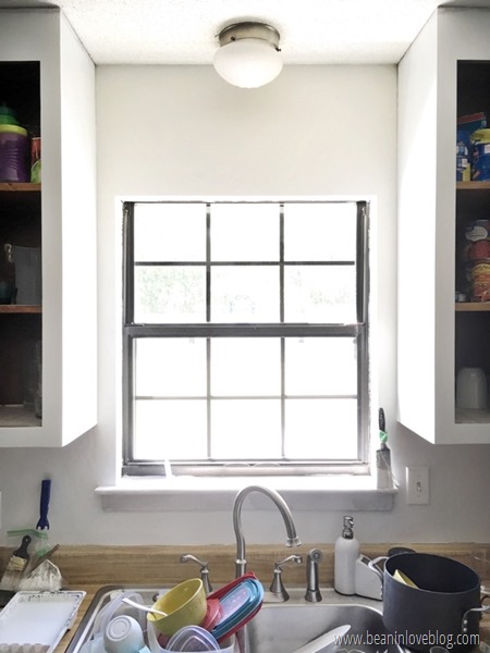
Here we are today:

When I first started this little reno, I wasn’t sure what I was going to do with the backsplash. I wanted to get rid of that countertop lip (like we did in our old bathrooms) but it’s one piece with the countertop and therefore, had to stay. My options were removable wallpaper (I went gaga over this one* when I saw it) and painting a stencil (I heart this one from Cutting Edge). Literally tiling the backsplash was out of the budget question as was peel-and-stick tile. I did have this (what I thought was) a really awesome idea involving marble contact paper and a circle cutter but then I found the cheap wallpaper so I’ll have to save that for a later date/another house. ;)
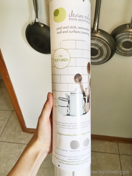
When I stumbled into this Devine, textured wallpaper at Dirt Cheap for $12, I had my answer. It orginally hails from Tarjay.
I love the clean look of subway tile and so I was SO happy about my find. I couldn’t get out of the store and back into the kitchen to put it up fast enough.
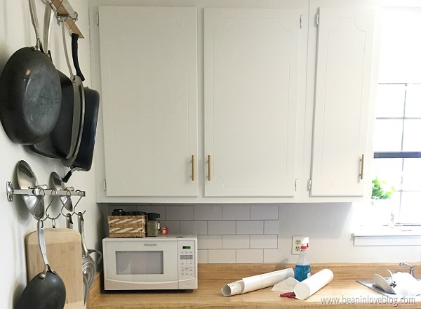
When I got home though, I noticed that the edge of the wallpaper was crooked, like someone had cut it. “Please don’t tell me…” Yep, it was probably a customer return (many of things Dirt Cheap sells are and usually, I have zero problems with that) and that customer returned it because they didn’t like it AFTER they had used some. Six feet to be exact. I was left with ten feet which covered 80% of my backsplash. Basically everything under cabinets is done but the wall over the stove is empty. Basically I could’ve done our entire kitchen with a whole roll that only cost me $12. Argh! So, I’ve been trolling our local Target for this wallpaper on clearance (they had an open tube of it out last week but it was still marked full price. Boo.)
Anyway, I’ll keep you posted on whether or not I find some in the next week. Eep. Pressure is on. I have an ISO ad on Facebook asking if anyone has used it and has four feet leftover so maybe I’ll get tossed a bit of luck there. Otherwise, I could just buy a roll and sell what I don’t use. TBD.
So let’s talk about this wallpaper and its installation. It got mixed reviews on Target. Personally, I thought it was pretty simple. There were a few tricky areas over outlets and the window sill that required a little bit of thought and measuring but overall, I’d do it again. The price? It’s ok. For a rental, this is an awesome, budget-friendly update. Had I purchased a brand new roll from Target, I could have done our whole kitchen for $35. That’s pretty good for something you that allows you to gussy up your space and then just remove when you leave (although it’s removal success is also TBD). For a house I owned, it’d be a nice temporary update while you were saving up to buy expensive tile but you could really subway tile your entire kitchen like we did our old one, for not much more than the wallpaper costs. So I guess whether it’s worth the price or not just depends on your situation.
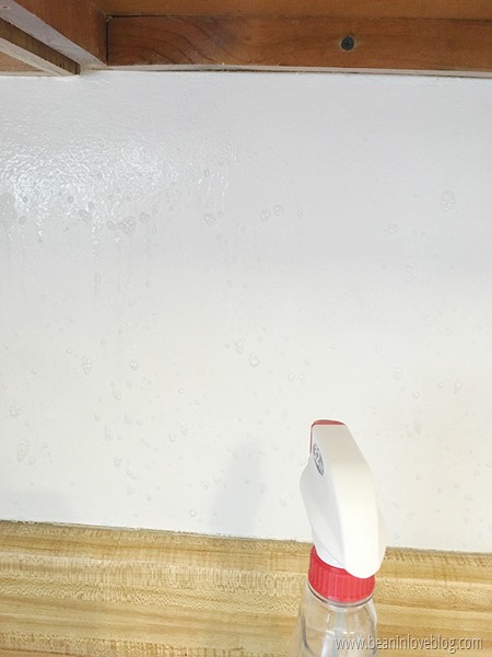
Back to the install though. Before I even started installing the paper, I painted the entire backsplash with some semi-gloss white paint we’ve had for a few years. The instructions on the wallpaper say that flat painted walls aren’t recommended to adhere the wallpaper to and ours were eggshell. Since they were being covered up, I just upped that a notch to be safe and went the semi-gloss route. But…BUT, the crucial thing that made this whole installation fairly easy was Windex/glass cleaner.
In his exact words, “USE WINDEX WHEN APPLYING to not get bubbles!! You will NOT get the bubbles out of it when applying if not. Apply a LOT of windex to the surface before sticking the paper on. This allows it to move around freely, so you can position it perfectly, and then when you get it where you want, take a window squeegee to smooth it out (like it shows in the product video) and you can get every piece perfectly flat. DO NOT skip that step!! Without windex behind it you'll get a million bubbles, tear the paper, never get them out and it'll be a royal pain. Makes your life way easier!”
He was 100% right. I can see how you might hate installing this stuff if you didn’t know about the windex tip. The Windex also allowed me to put this up all by myself vs. having another person helping. For me, that meant I could do this while Anthony was at work no problem instead of having to wait until he was home.
To install, I liberally sprayed the expanse of wall I was going to wallpaper next, peeled off half of the backing, stuck that part to the wall and moved it to where I wanted it, then peeled off the rest of the backing to stick on the rest.
When the entire piece was stuck good, I went over it quick with our shower squeegee to get out any air bubbles and moved on to the next piece.
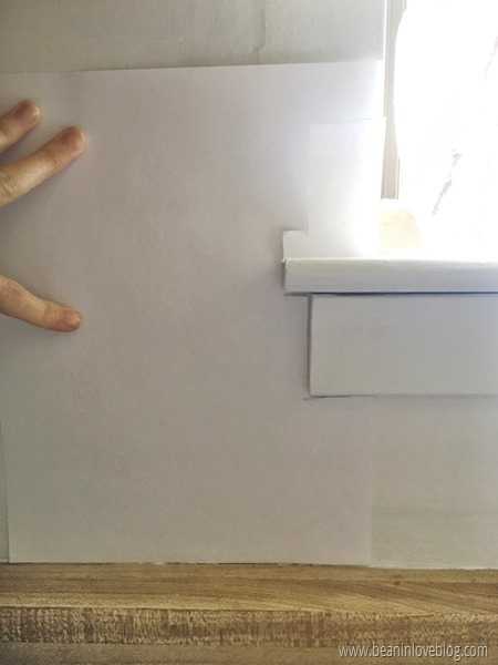
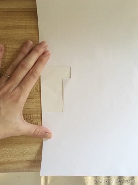
Like I mentioned above, things got a little tricky around the window sill. It helped to grab a piece of paper and make a template of the wall next to it before I started.
I was lucky in that the sheet of wallpaper that would cover this area was a full one so all I had to do was trace my template onto the edge of the wallpaper and put it up. Side note: I traced it onto the back of the wallpaper on the backing just in case I messed up…I didn’t want marks on the front of the tile if that was the case.
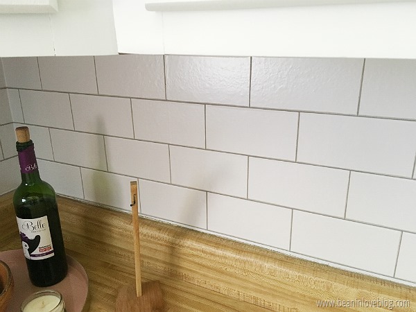
Another thing about the window sill area is that, as I was going along the wall, I decided to skip that narrow piece under the sill and come back to it in the end with the scraps I had leftover. I was working from left to right and the wall to the left of the sink used three entire pieces without me having to cut widths and so it just made sense at the time to skip to the oppposite wall and keep going with large pieces. What I didn’t think about until after I was done was the fact that now the tiles probably wouldn’t line up. Shoot. So, if you look at the picture above (and maybe you already noticed), you’ll see that right above the soap dispenser, there’s a smaller tile. I cut a tiny piece of grout out of my scraps after and stuck it right above that tile to make it blend in a little more and I think maybe it worked. At least Anthony hasn’t noticed yet. :D And you’d never notice that little piece of grout is a cut-out. It kind of amazed me. :) Actually, I had to fill in another little piece of grout somewhere else too and even though you now know it, you’d never be able to find it. ;)
Things also got a little crazy in the corner.
That beveled cut in the countertop got interrupted at some point (possibly when the dishwasher was installed) and so the left side is a smidge higher than the right.

Really all that means for the wallpaper is that the bottom edge of paper wouldn’t sit flush with the top of the countertop lip on the right side. See how the bottom grout line doesn’t meet the countertop?
The countertop actually slants downward too so it gets wider as you go but whatever. It’s one of those things that you’d maybe not notice, right? Tell me it’s so. ;)
Another thing I should mention about this wallpaper is that it’s pretty thin. Durable but thin. Because of this, you can see the texture of the wall through the paper. Our walls aren’t super textured but they aren’t super smooth either, as you can see in the picture above. So I’d say that you should probably stay away from this stuff if you’ve got anything like orange-peel or knock-down texture on your walls. :(
The unfortunate thing about tile or brick wallpaper is that it looks great and is fairly realistic, placement-speaking, where you started but you just never know what’s going to happen at the end. In this case, I had to cut a four-inch wide piece to fill in the extra four inches of wall at the end and so that left me here with a couple of bricks just starting:
I could have avoided this by starting my papering in the middle of the wall and going out from there but that seemed like too much thinking and ending this way doesn’t really bother me. I mean, even starting in the middle could of ended this way too so I guess you just don’t know until you get there. If it were real tile, you could slap up a piece of trim and call it a day. Not so with tile wallpaper. Sudden endings are just inevitable with wallpaper like this, I guess.
I think that’s all I wanted to say about this wallpaper. I’d really recommend it if you’re in a rental and looking for a temporary pick-me-up for your backsplash! Let me know if you try it! And for goodness sake, don’t forget the windex! ;)
. . .
*affiliate links included in post






I've never heard of this wallpaper before, so cool! I love it.
ReplyDeleteI hadn't either before I ran into at Dirt Cheap! It's such a great idea!
Deletei just realized you’re from Mobile! Love the kitchen backsplash paper. It looks great!
ReplyDelete