You’ll never know how excited I was when I found out that the One Room Challenge just started on April 4th! If you don’t know what that is, check it out here. Basically, you take on a room (entirely redo, refresh, remodel, whatever have ya) and you get six weeks to do it. I’ve always seen it come up on Instagram and other blogs but I’ve been always the spectator and never the participant. Not this year though! I’ll be linking up and following along with other guest participants here!
I’ve got until May 10th to take our kitchen from old to gold-winning and ironically, I started ripping down the wallpaper in our kitchen a week before I found out the challenge was happening so I’m right on time. But *gulp* I’ll need every single one of those six weeks since I’m on a serious budget and I don’t have the luxury to just go out and buy what I need. I’ve got to find it secondhand, on clearance, or on mega-sale…you know how I do. Oh yeah, and I have four little kids running around.
You might be wondering why I’m tackling a kitchen in a rental house. Why waste time, energy, and money on something you’ll be leaving in a year or two? Valid question. Answer? Because I love doing this stuff. As a stay-at-home mom, daily life can get a little monotonous. It’s a beautiful life and I’d have none other, but getting out my paint brush and planning decor is the equivalent to going out and getting my hair or nails done for me. It’s self-care – getting to expand my diaper-changing and feeding horizons to project beauty onto the space that I’m changing diapers and feeding in. I think it’s important to love the space you’re living in too so spending a little bit of money to make that happen here is well worth it, in my opinion.
With that, here are the plans for the kitchen: -take down the wallpaper-paint the walls
-paint the cabinets and replace the hardware
-make a pendant to replace the light over the sink
-redo the fan shade
-repaint the rug (maybe?)
-hang a pot rack
-hang a spice rack over the stove
-install some sort of backsplash
The budget: $150
Total spent so far: $18
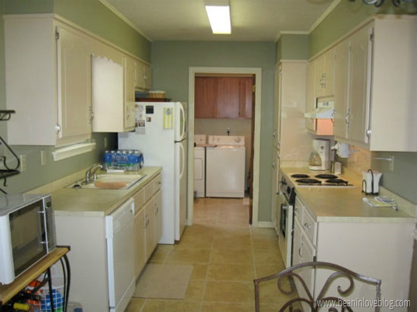
Here’s the a picture of the kitchen I ran in and took one day before we moved in: 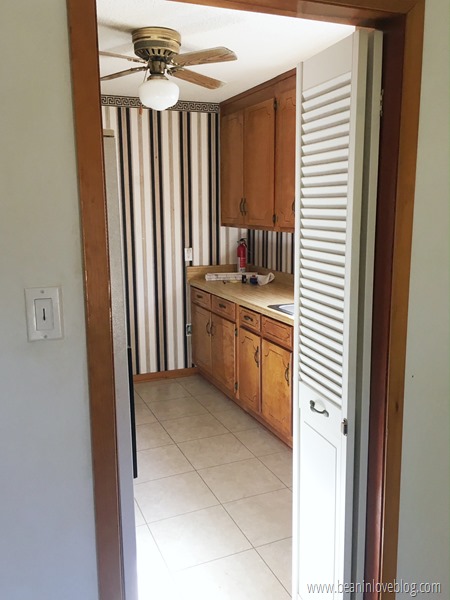
It’s ok though. My six-year old is on the ball and really into taking in-process shots for me.
I’m not going to go into the whole taking-down-the-wallpaper process (Young House Love and Today’s Homeowner have some good posts on it though!) But I’ll tell you, it was an arduous one and didn’t happen as quickly as scrolling down to an after picture. Anthony was gone for a few days last week and so I spent every naptime and post-bedtime steaming and scraping paper off the walls whilst Pandora kept me company. There were some hiccups with super stubborn glue and a good amount of spackling after to get to the finished product, making me happy this whole house isn’t wallpapered. :)
After the wallpaper was all down, I primed the walls with green primer.
Why green, you ask? Well, didn’t you know green primer is the best kind of primer? Holds the paint on real well. Or is that a DIY secret that’s been hiding from you? Ha! I kid, I kid. Ease that FOMO because the only reason we used green primer was because we found some new, unused primer in a cabinet that happened to be green and we used it. Zero dollars.
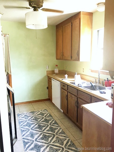
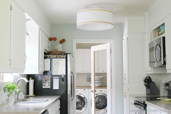
And, are you ready for this? De-papered, primed, and painted. Boom shaka laka.
Oh yeah, and I added a shade to the fan that helps up the pretty…one of my favorite hacks. The shade itself is a little beat up and is going to get a fun little makeover of it’s own but isn’t the difference between wallpaper and no wallpaper great? I know it’s not quite electric chair shocking but you can’t win an argument that it looks worse. Even the dishes in the sink are overlooked…right? C’mon, I didn’t have time to paint and clean for a picture. ;)
We painted the walls Pure White by Sherwin Williams. I’m not one of those everything-has-to-be-white people (though I LOVE white) but I really have no clue what other color to pair with the honey oak (a nice phrase for orange) trim in this house that is staying honey oak because painting that would take up way too much time. But I really love this white. I don’t feel like it really leans towards any color; it doesn’t really have an undertone and is just what it says, pure white. However, it’s only adorning the walls in our laundry room and kitchen right now (and half of one small wall in the living room) and both of those rooms get a good amount of light so I don’t know how it would fare in a darker room. I’ll keep you posted as it’ll go into one of ours soonish.
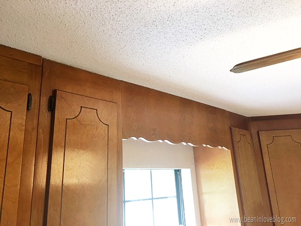
There’s another big change/difference we made in the kitchen last week. I should say little change, big difference. We took the header (I think that’s the technical name…) out from between the cabinets over the sink.
You know, that big, curvy piece of wood right above the window?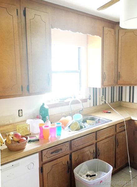
Anyway, we had a header over the sink in our second house too that we took down and it really just opens things up like crazy. They’re usually (if not always) there just for show. And those curvy ones are so 1980’s and earlier.
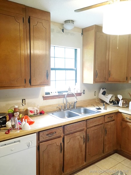
Here’s what that space looks like sans header:
It’s like going from 1985 to 2018 in 20 minutes. Ok, maybe 2005. Either way…
I’m going to try to walk you through how to take one out all by yourself. Though it might seem intimidating, it’s really not and it’s fairly easy to do with just a couple of common tools. I’m not positive on this but since both of our headers were installed the same way, I’m going to assume they’re all pretty much put up similarly.
Since they’re decorative, they’re not serving any purpose besides being up…they’re not supporting anything important or serving any function except maybe hiding an ugly, over-the-sink light fixture. Ours was held into place by a few nails and that’s it. If the person that put your header in was super ambitious, they might’ve used some wood glue with those nails which will make the taking-down process a little harder but doable nonetheless.
The tools I used were a hacksaw* and a pry bar*.
There were four nails holding our header into place; one in each corner. Two nails were up top, going through the front of the header into a piece of wood in back and two went diagonally up into the header and into the side cabinets. The first thing I did was “cut out” the two nails at the bottom of the header going into the side cabinets. The nail heads were buried in the header so there was no way to get them out besides cutting them out. So, I just grabbed our hacksaw and with a little bit of energy, I cut off the two bottom corners of the header that held the nails.
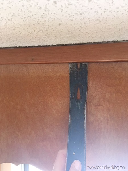
To expose the top two nails, I had to carefully remove the trim along the top of the header. Carefully because it has to be recut and rehung to cover the top of the two side cabinets. The easiest way to remove it was to first find a spot between the nails holding it in that allowed me to slip the pry bar under and then I slowly slid the pry bar along to where the nails where and pried those nails out. In most cases, the nails came out attached to the trim but a few of them slipped throught the trim and stuck to the cabinets or header underneath.
See ya later trim! No really, it’ll go back up later…
With the trim gone, I could now see the two nails that were holding the header in place at the top corners.
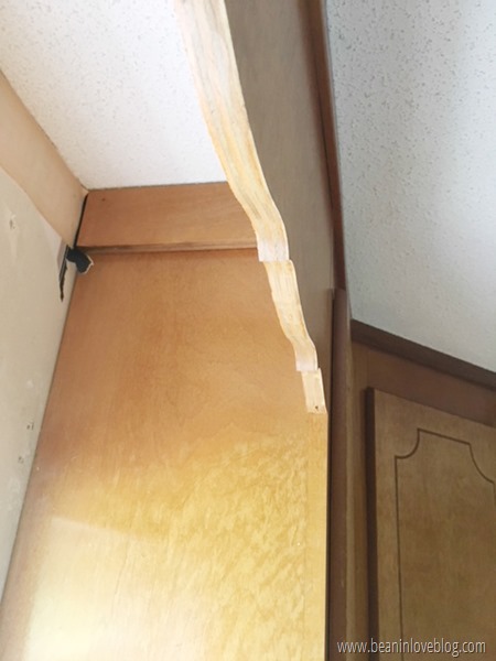
They were nailed into two boards behind that were, in turn, nailed to the side cabinets.
To free the header up top, I slid the pry bar into the space between the board and the header, and pried the header free. Remember that I had already cut the bottom two nails free so the header came right out after this step.
The last thing I had to do was remove those two boards attached to the side cabinets. I did that the same way I removed the trim – I slipped the pry bar underneath, found the nails, and pried the board off.
Done.
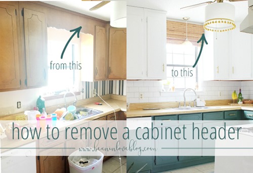
Here’s our old kitchen with the header:
And here it is after we took it down (and painted…a lot):
Our old kitchen had a soffit above the cabinets whereas our current kitchen has ceiling height cabinets but both headers were installed the same and came out the same. And, both kitchens took a breath of fresh air once they had room to above the windows.
So, if your kitchen is sporting a header from the 1900’s, don’t be afraid to move into the 2000’s and take that thing down! Even if you can’t remodel your entire kitchen, just making this one simple change will make a big difference!
. . .
This coming week I’ll be painting the cabinets! The uppers are going white and the lowers…well, I don’t know yet. I’ve got a few color ideas swimming around that I’ll share later. Stay tuned!
*affiliate links








Paint makes SUCH a big difference, I love it every time. We have one of those ugly headers over our kitchen sink but it's attached to some very inconvenient cabinets up there, so I haven't been able to rip it out. It's one of the things I'm desperate to do once we finally start our kitchen reno!
ReplyDelete